The Colour Blue in Art
“A certain blue penetrates your soul” -Henri Matisse
Blue has been named the world’s favourite colour after topping polls in countries across the world. Associated with clear skies and vast seas, the colour is often seen as calm, serene and even spiritual. It can be bright and intense or icy and cold, and symbolises sadness in a way that no other colour quite matches. Indeed, it has an almost inexplicable pull to it.
We looked at art that celebrates this beautiful and elusive colour.
Lapis Lazuli
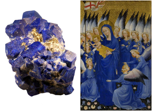
Right: Mary with Child and Angels, right panel of Wilton Diptych, c.1395-9 (egg tempera on wood), Anonymous / National Gallery, London, UK / Bridgeman Image s
Lapis Lazuli is a beautiful, deep-blue stone which has been highly valued for centuries. Evidence for its use as a pigment has been found as early as 2,200 B.C.E. in Ancient Egypt. At the end of the Middle Ages, lapis lazuli was ground into a powder to make ultramarine, a very expensive blue pigment which became popular during the Renaissance and Baroque periods. Furthermore, as blue has long been associated with the heavens in Christianity, ultramarine was used extensively in portrayals of the Virgin Mary.
Goethe’s Theory of Colours
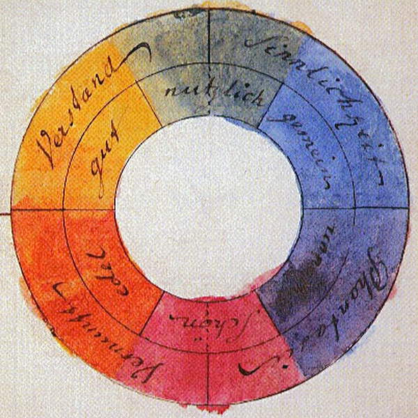
“The colour [blue] has a peculiar and almost indescribable effect on the eye. As a hue it is powerful — but it is on the negative side, and in its highest purity is, as it were, a stimulating negation. Its appearance, then, is a kind of contradiction between excitement and repose.” – Goethe
German writer and politician Johann Wolfgang von Goethe was first inspired to pursue the study of colour during a trip to Italy, where he realised that artists were able to analyse all the elements of their paintings except for colour. He published his Theory of Colours in 1810, which outlined the wheel of complementary colours for the first time, pairing blue together with orange. The theory was widely adopted in the art world, most notably studied in depth by J.M.W. Turner and Kandinsky.
Impressionism
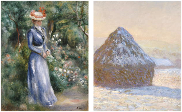
Right: Wheatstaks, snow Effect, Morning, 1891 (oil on canvas), Claude Monet (1840-1926) / J. Paul Getty Museum, Los Angeles, USA / Bridgeman Images
Impressionists were particularly fond of representing in shadows in a blue hue. While previous artists portrayed shadows as a shade of grey, many impressionists such as Monet and Renoir noticed that the blue of the sky reflects onto white surfaces that are under shadow, an effect that can be seen most clearly on snow. This brought brightness and depth to paintings, helping to capture the moods and emotions that impressionists are so well-known for.
Picasso’s Blue Period
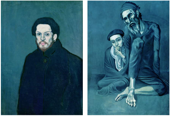
Right: Old Jew and a Boy (Beggar with a Boy) 1903, Pablo Picasso (1881-1973) / Pushkin Museum, Moscow / Bridgeman Images
From 1900 to 1904, Picasso had his “Blue Period”, triggered by the suicide of his friend Carlos Casagemas. This uses a cool and sombre shade of blue to reflect the despair of his subjects. During this time, he often painted social outsiders such as prisoners, circus people or poor people. In 1901, at twenty years old, he painted his own self-portrait.
Yves Klein
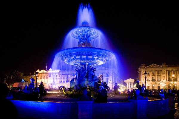
“Blue has no dimensions; it is beyond dimensions… blue suggests at most the sea and the sky, and they, after all, are in actual, visible nature what is most abstract.” – Yves Klein
Yves Klein dedicated the majority of his life’s work to the colour blue. He is well-known for inventing his own colour, International Klein Blue (IKB), using ultramarine pigment suspended in a polymer binder which retains the brilliance of the pigment. He used this IKB colour in various ways, experimenting with the pigment on sponges, globes, and even naked women. For Klein, blue was more than a colour: he considered it a spiritual experience that goes beyond the material realm.
New Blues
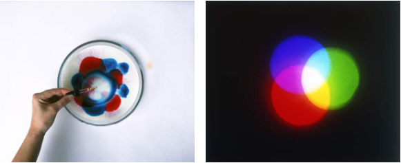
Right: Overlapping red, green and blue / Dorling Kindersley/UIG / Bridgeman Images
As science advances, new blue pigments are being created. For example, in 2009, researchers at Oregon State University accidentally discovered “YInMn Blue” pigment while heating chemicals in search new materials for electronics. They received significant interest from art restorers, because the pigment is similar to ultramarine from the lapis lazuli rock, but is more durable. Unlike ultramarine, which fades over time, the YInMn blue pigment is highly durable, with no change in the colour when exposed to high temperatures, water, or mildly acidic and alkaline conditions.
Overall, we’ve seen that blue can be made by rocks, plants, chemicals or light. It can be used on canvas, wood, water or naked bodies. It can be seen as bright, sad, sacred, or calm. Looking at the use of blue in art may not bring us any closer to understanding it’s pull, but it definitely makes us appreciate it in all its different forms.
