The Art of Cartography: Maps designed by people who never saw the globe
The British Library write that their collection of maps, plans and views is ”one of the largest in the world, numbering some 4.5 million”. From the 15th century onwards, technological and social advancements meant that explorers across the world could begin to record their explorations (and exploits) across the planet.
Thanks to the British Library, we can examine changes in the way the world was mapped through the centuries and discover how the art of cartography evolved.
1175
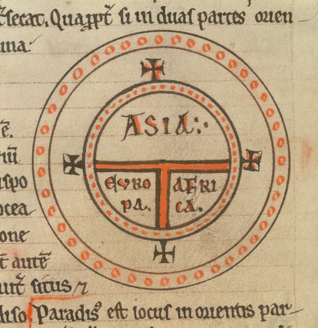
Diagrammatic world map, c.1175 (vellum) / British Library, London, UK / © British Library Board. All Rights Reserved / Bridgeman Images
This diagrammatic world map, circa 1175, is drawn in the beatine (also known as T-O or beautus) style. It represents a shift in cartographic method in that the world, rather than a single town or village, was attempted to be represented, even though the map only actually represents one half of the spherical Earth. It is round because the world was thought to be circular, with an ocean surrounding it and dividing the three main regions – Asia, Europe and Africa. It is therefore a record of the well-known inhabited areas of the globe.
1470
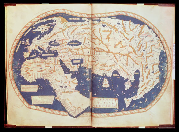
Map of the world, from “Insularium Illustratum”, by Enrico Martello, being an account of the islands, chiefly of the Mediterranean, with coloured plans, Italian, c.1470 / British Library, London, UK / © British Library Board. All Rights Reserved / Bridgeman Images
This map shows what is now collectively known as the ‘Old World’. Replacing the diagrammatic representation used in the T-O map, it is an attempt to recreate the landmass as it was thought to exist in the oceans is shown here. The geography shown, while lacking the precision of later maps does depict recognisable landmass. It is stunning to know that there was a time when the cultures, peoples and customs of the rest of the world remained completely undiscovered.
1546
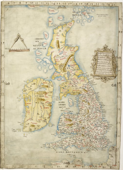
Map of the British Isles, The ‘Cottonian’ map of the British Isles. Originally published/produced in ca. 1534 – 1546. / British Library, London, UK / © British Library Board. All Rights Reserved / Bridgeman Images
This map of the British Isles is notable for its detail and for the typography used. The physical geography of the British Isles is recorded quite accurately. Place names are included and noted – complete with medieval Germanic font – and while the range of the map is impressive much of Scotland and Ireland appear simply as uncharted terrain.
1550
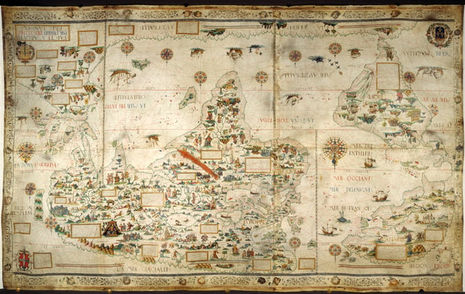
Desceliers map of the world; with illuminated borders, drawings, and the arms of France, Montmorency and Annebaud / British Library, London, UK / © British Library Board. All Rights Reserved / Bridgeman Images
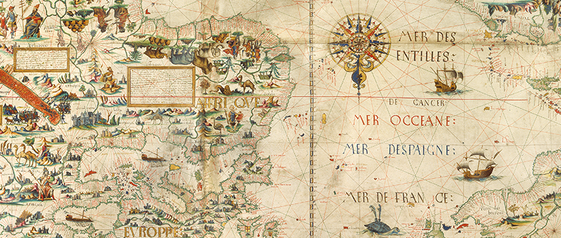
This illustrative map demonstrates the beginnings of a wider understanding of the world’s layout as we know it today. Portions of text and images are upside down, which seems to indicate this map was drawn with the intention of being looked down upon or walked around. Great care has been taken to include shipping routes and labels on each of the main continents, with drawn imagery of native populations and buildings taking precedence over labelling all places.
1720
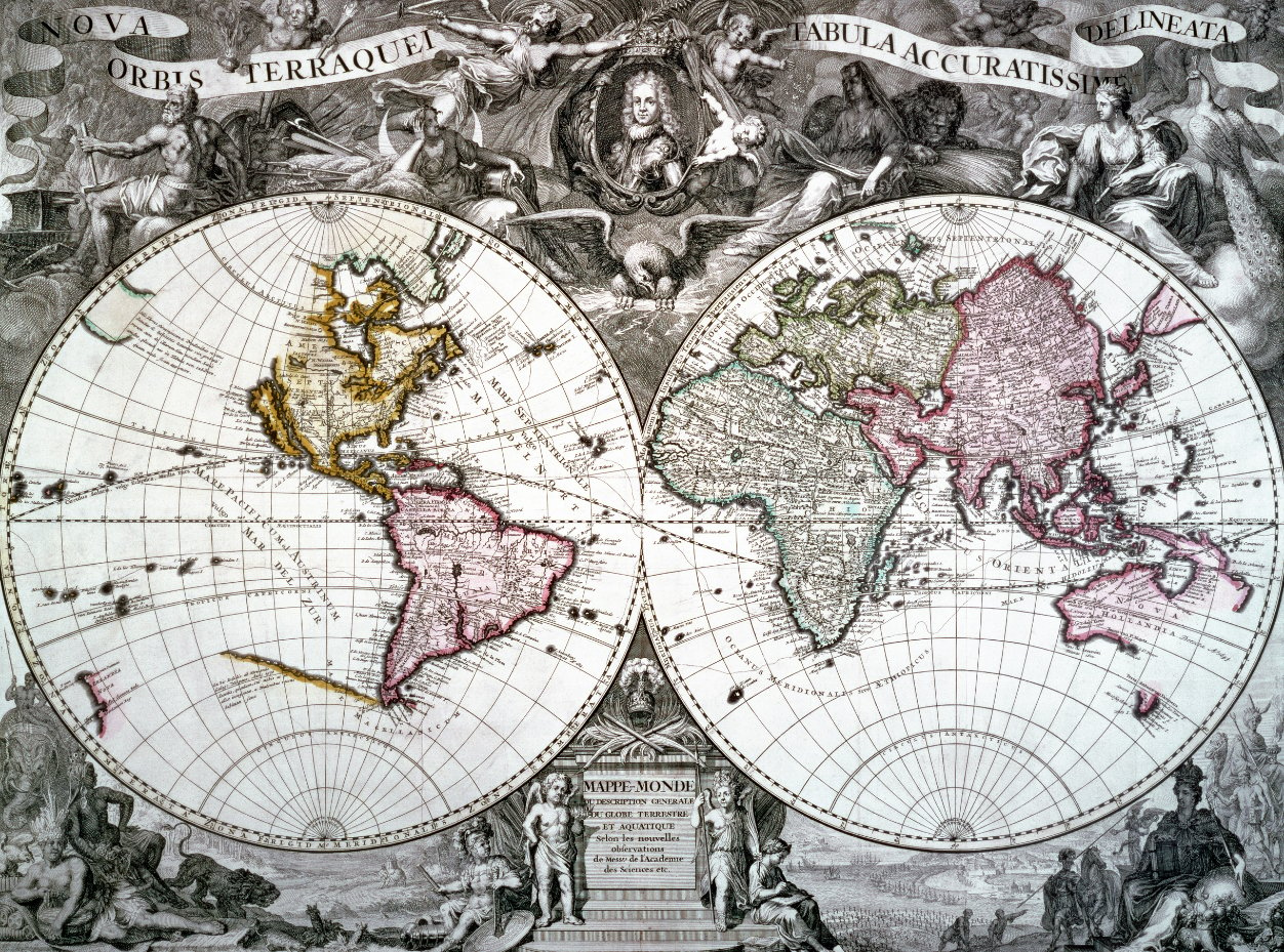
Map of the world, 1720 (engraving), French School, (18th century) / British Library, London, UK / © British Library Board. All Rights Reserved / Bridgeman Images
This 1720 map includes the new – at the time – observations of the Academy of Sciences, Paris. Maps drawn in this way – ie depicting the world as a sphere – were common in this era. Much of our world’s geography as we know it is included here, with great care taken on the ornately detailed surrounding drawing. The colour-coding forms a regular part of mapping from now on.
1860
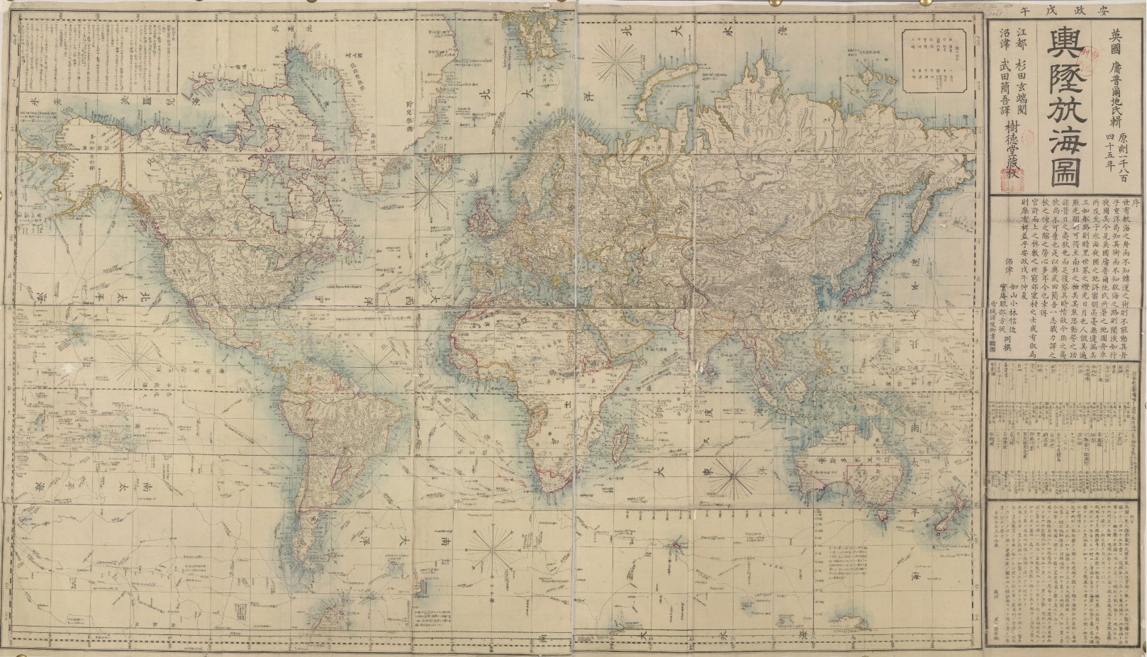
World map / British Library, London, UK / © British Library Board. All Rights Reserved / Bridgeman Images
This finely detailed map is thought to originate from Edo, now Tokyo in the 1860s. During this time, Edo was the seat of the Tokugawa Shogunate, who saw the region grow to become one of the largest cities in the world at that time. Light colour coding has also been used to outline the various regions and the countries they belong to.
1897
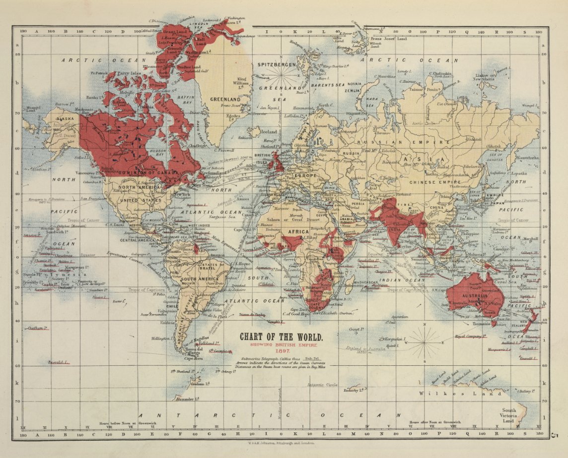
World map, Empire Atlas showing British Possessions at home and abroad / British Library, London, UK / © British Library Board. All Rights Reserved / Bridgeman Images
This final map displays cartography more in tune with what modern audiences are used to, however the emphasis here is highlighting the regions of the map under ownership of the British Empire. From a historical standpoint this is fascinating, as this is the most prominent element of this map which dates it quite substantially. Routes of travel throughout the seas are also recorded.
Find out more:
See more British Library cartography from a wide selection of eras in the Bridgeman Images Library here
Discover the story of Captain James Cook, famous cartographer and European explorer on the Bridgeman Blog here
Read an overview of the Art of Mapping, also on our blog here
