Colour Blocking – Tracing The 2018 Trend
Colour Blocking is defined as the selection, combination and application of opposing colours on the colour wheel in a variety of distinct ways. Now a fashion, interior and design trend in Summer 2018, we’re looking back to the archive to examine where this particular trend first emerged, and how it has been used by artists in the modern era.
Usage of colour and colour theory in arts lagged behind scientific forays into colour research until the 20th century, when artists at the Bauhaus in Wiemar Germany (such as Wassily Kandinsky and Johannes Itten) began to pointedly experiment with spectrums, colour wheels and combinations, taking note of their findings and implicating scientific reasoning behind the effect their instinct of combining various colour combinations.
Piet Mondrian
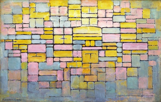
Tableau no. 2 (Composition no. V) 1914 by Dutch artist Piet Mondrian / Universal History Archive/UIG
Though the subject is hotly debated, experts state that Piet Mondrian – with his unique approach to minimalist painting – pioneered the block-coloured style typically associated with today’s modern designs, which he christened ‘Neo-Plasticism’ in which only primary colours and horizontal/vertical lines were allowed.
Mondrian discovered the style while attempting to minimalise his work down to its bare components. While the example above isn’t indicative of his most popular works, it best reflects the usage of Colour Blocking that is seen in contemporary society. Pastel colours, especially blues, yellows and pinks are very on trend at present.
Arthur Jackson
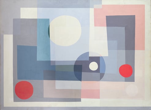
Abstract, 1934 (oil on canvas), Arthur Jackson (1911-2003) / Private Collection / Photo © Peter Nahum at The Leicester Galleries, London
Arthur Jackson is one of many artists operating after Mondrian’s time who were heavily inspired by his work, driven by a minimalist mindset. Jackson’s method of overlaying various jaunty shapes with a common colour-themed palette is very easy on the eyes – here a combination of blue and red. His colour choice here feels very contemporary, with primarily light shades contrasted nicely with darker, soft blues.
Anne Truitt
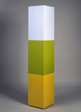
A Wall for Apricots, 1968 (acrylic on wood), Anne Truitt (1921-2004) / Private Collection / © annetruitt.org
Anne Truitt brought minimalist colour blocking into the 3D space in the 1960s with cuboid sculptures of various sizes and painted fencing displayed the gallery space. Here, the emphasis was on the colour choices used and their relationship to the object and its surrounding space. Names for works typically correlate whimsically to the colours used.
Kazimir Malevich
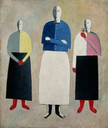
Three Little Girls, 1928-32 (oil on board), Kazimir Severinovich Malevich (1878-1935) / State Russian Museum, St. Petersburg, Russia
Kazimir Malevich was one of the abstract geometric artists operating in the early 1900s, marking him as one of the earlist artists to use such a style. His 1917 ‘Black Square’ (simply a black square painted on an otherwise empty canvas) broke artistic boundaries, and he combined colours with abstractly arranged shapes which appeared to float in space. Here, he blocks segments of colour to another Malevich staple – his uncannily statuesque figures. Each of the three girls looks the same – roughly humanoid but with no other defining features – but their colours are what draw them apart.
Robert & Sonia Delaunay
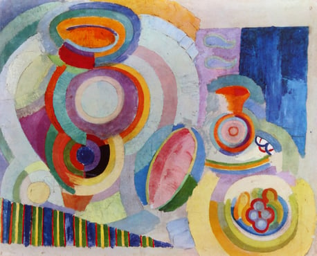
Robert Delaunay Still Life Portuguese, 1917. Robert Delaunay (1885 1941) / Universal History Archive/ UIG
Robert & Sonia Delaunay lived and breathed art – the pair are most known for forming the Orphism art movement. Robert’s paintings are a classic example of Colour Blocking applied in an Orphist style. One can loosely make out vaguely recognisable shapes, but appreciation of his command of colour is universal. Soft, warm reds and yellows clash sharply with cold blues and purples. Sonia meanwhile was known for taking the visual a step further – with outfits picked out in Orphist and Geometric designs, she’d travel in her Citroen; a custom painted model featuring one of her geometric colour blocked designs. What a statement!
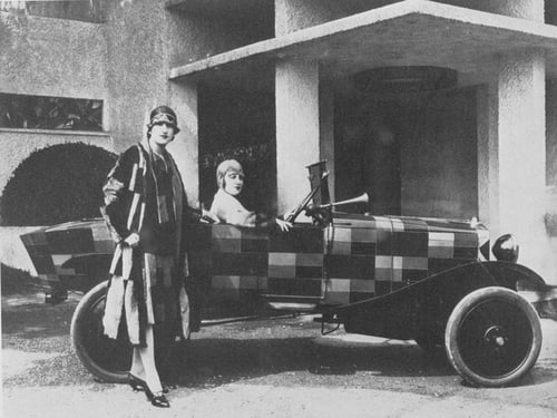
Sonia Delaunay and her matching decorated Citroen B12, 1925 (b/w photo), French Photographer, (20th century) / Private Collection
Atanasio Soldati
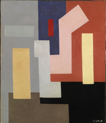
Composition (Composizione, 1935-36), Atanasio Soldati (1896-1953) 20th century, charcoal on tracing paper / Museo del Novecento, Milan, Italy / Mondadori Portfolio/Electa/Luca Carrà
Atanasio Soldati combines simple, geometric shapes and appropriate colours to make abstract paintings that are very easy on the eye. Artworks like these have much have in common with today’s contemporary colour-blocked interiors, furnishings and prints.
Rose Electra Harris
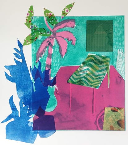
The Plants are on their way out, 2015, aquatint etching with chine-collé, Rose Electra Harris / Private Collection
Rose Electra Harris is a contemporary artist at Bridgeman Studio. She currently lives and works in London and specialises in both etching and screen-printing, and utilises vivid, bold block colour methods – typically picked out in neon or pastel – to explore her unique themes surrounding our indoor culture. Exploring the notion of the room as an oasis, Rose creates ambiguous and dysfunctional journeys for the viewer, going nowhere and everywhere, engaging the visual imagination.
Stephen Dow
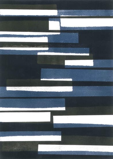
Bridgeman Studio Artist Stephen Dow is known for his minimal screenprints which combine 3-5 colours in a blocked fashion. These colourful works are very contemporary in style (as do his his works in monochrome). Dow utilises a wide range of styles for his prints and all demonstrate the strengths of their medium.
Lyubov Popova
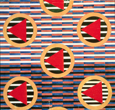
Red Triangles in Circles (w/c on paper), Lyubov Popova (1889-1924) / State Russian Museum, St. Petersburg, Russia
In the 1980’s Yves St Laurent displayed mini-dresses using Mondrian’s designs, and women of the Bauhaus often crafted geometric textile-based designs. Today, in the fashion industry we see regular examples of how abstract geometric aesthetics are utilised by top clothing designers.
In 1921, Lyubov Popova made the decision to create abstract geometric designs with the intention of using them on everyday products for mass production, inspired by the idea of a new world set about by the communists. In doing so, she actively participated in the creation of a new environment and the aesthetic seen in her work can also be spotted in the work of other Futurist/Cubist Russian Artists of the time.
Funasaka Yoshisuke
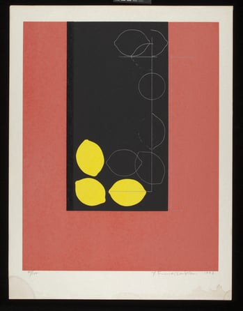
Lemon-340, 1973 (colour woodblock print & silkscreen), Funasaka Yoshisuke (b.1939) / Indianapolis Museum of Art at Newfields, USA / Gift of Holliday T. Day
Funasaka Yoshisuke combines sections of bold colour with repeated imagery, the inclusion of which makes the colour segments function more as an accompaniment than a focal point. One of his favourite shapes to repeat are fruit – especially lemons – the smooth outline of which contrasts nicely with the sharp, angular lines of his backgrounds.
Read More
Dive into our Colour Blocking in Art lightbox
Fashion Through The Ages Includes a spotlight on Mondrian’s Yves Saint Laurent mini dress

