Images and Licensing:
View a gallery of images for Rose Quartz & Serenity
For information about researching or licensing images, contact the Brigeman team at their offices in New York, Paris, Berlin and London.
“Colors this season transport us to a happier, sunnier place where we feel free to express a wittier version of our real selves”
– Leatrice EisemanExecutive Director, Pantone Color Institute
Each year, Pantone declares a color of the year forecasting which specific hue designers and consumers will all supposedly be using, wearing and buying for the following 12 months.
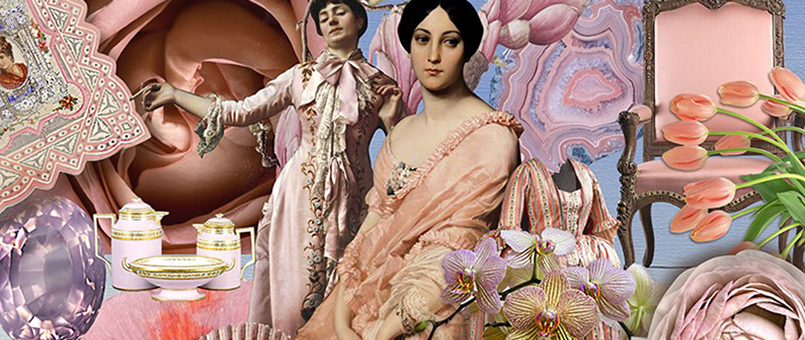
For the very first time, the Pantone Colour Institute has selected not one, but the blending of two shades for 2016: Rose Quartz & Serenity.
Just like its name reveals, this color received its inspiration from the world’s current fascination with mindfulness and well-being as an antidote to modern day stresses. This blend opens up a world of welcoming hues that psychologically fulfill – at least for a moment or two – our yearning for reassurance and security in a world that finds itself amid crisis after crisis.

Aix en provence, France / Simon Fletcher / Private Collection / Bridgeman Images
On Pinterst: 2016 Pantone Colours of the year
Blended together, Rose Quartz and Serenity remind us how the mind and body react to the embrace between a warmer rose tone and a cooler tranquil blue.
As the color wheel teaches us, the connection of these two hues offers an aesthetic that is at once both happy and soothing, offering a sense of an idyllic childhood innocence. Rose Quartz is an impressive yet gentle tone that conveys compassion and a sense of composure. Serenity is weightless and airy, like the expanse of the blue sky above us, bringing feelings of respite and relaxation even in turbulent times.
The time of coexistence 2008 / Kim Sang Soo / Private Collection / Bridgeman Images
What is the Pantone color and what does it all mean?
In short, the annual Pantone color is defined as: “A symbolic color selection; a color snapshot of what we see taking place in our culture that serves as an expression of a mood and an attitude.”
Pantone was founded in 1962 when the company – at the time a small business which manufactured color cards for cosmetics companies – was bought by Lawrence Herbert. Upon his purchase, the company immediately changed direction away from color cards to invent the first color matching system in 1963.
Pantone launched the first Color of the Year in 2000 using its own color experts to comb the world over for the color influences that best define the global zeitgeist.
Dawn over Lake Piccola (oil on canvas) / Derek Hare / Private Collection / Bridgeman Images
As we enter 2016, remember to keep breathing, keep smiling and when in doubt, buy something rosy and something a bit more blue and call it a day.
View a gallery of images for Rose Quartz & Serenity
For information about researching or licensing images, contact the Brigeman team at their offices in New York, Paris, Berlin and London.